Online Forum Analyze
A Journey Through Public Comment Data
Chapter 1: The Inception
It all started with a question: What can we learn from the vast ocean of public comments floating around the internet? These comments—raw, unfiltered opinions shared by people across the world—are a treasure trove of insights waiting to be uncovered. As someone deeply fascinated by data, I decided to dive into this ocean and see what treasures I could find.
My project began with a simple idea: collect public comment data from a popular website, store it in a local database, and then analyze it to extract meaningful patterns. But like any good journey, the path was full of unexpected twists and turns, each adding to the richness of the experience.
Chapter 2: The Hunt for Data
The first challenge was finding the right data. Public comments are scattered across countless websites, each with its own structure and format. I chose to focus on a popular site where users freely share their thoughts on a wide range of topics. The site provided an API, which I used to systematically download the comments.
But downloading data is never as simple as it seems. I had to navigate through API rate limits, handle incomplete data, and ensure that the comments were downloaded in a structured format. After several iterations and tweaks to my script, I finally had a robust process in place.
import requests

# Requesting comments from the API
response = requests.get("https://example.com/api/comments")
comments = response.json()

# Handling API rate limits and retries
while not response.ok:
    time.sleep(5)
    response = requests.get("https://example.com/api/comments")
    comments.extend(response.json())
With the data in hand, the next step was to figure out how to store it efficiently.
Chapter 3: Building the Foundation
Storing the comments presented its own set of challenges. With thousands of comments to manage, I needed a database that could handle the load while allowing me to easily query and analyze the data. I opted for SQLite, a lightweight yet powerful relational database.
Designing the database schema was crucial. Each comment needed to be associated with a user, a timestamp, and other metadata. Normalizing the data—splitting it into related tables—helped to ensure that the database was efficient and scalable.
import sqlite3

# Establishing a connection to the SQLite database
conn = sqlite3.connect('comments.db')
cursor = conn.cursor()

# Creating tables for comments and users
cursor.execute('''CREATE TABLE users (
                    user_id INTEGER PRIMARY KEY,
                    username TEXT)''')

cursor.execute('''CREATE TABLE comments (
                    comment_id INTEGER PRIMARY KEY,
                    comment_text TEXT,
                    user_id INTEGER,
                    timestamp DATETIME,
                    FOREIGN KEY(user_id) REFERENCES users(user_id))''')

# Populating the database with downloaded comments
for comment in comments:
    cursor.execute('''INSERT INTO users (user_id, username)
                      VALUES (?, ?)''', (comment['user_id'], comment['username']))

    cursor.execute('''INSERT INTO comments (comment_id, comment_text, user_id, timestamp)
                      VALUES (?, ?, ?, ?)''',
                   (comment['id'], comment['text'], comment['user_id'], comment['timestamp']))

conn.commit()
With the database set up, I felt like I had built the foundation of a house—now it was time to start constructing the walls and filling it with content.
Chapter 4: Delving Into the Data
With the data securely stored, I was eager to start analyzing it. I began with some basic queries to understand the structure of the comments—how many users were contributing, what times of day were most active, and which topics were generating the most discussion.
# Query to find the most active users
cursor.execute('''SELECT user_id, COUNT(*) as comment_count
                  FROM comments
                  GROUP BY user_id
                  ORDER BY comment_count DESC''')
most_active_users = cursor.fetchall()
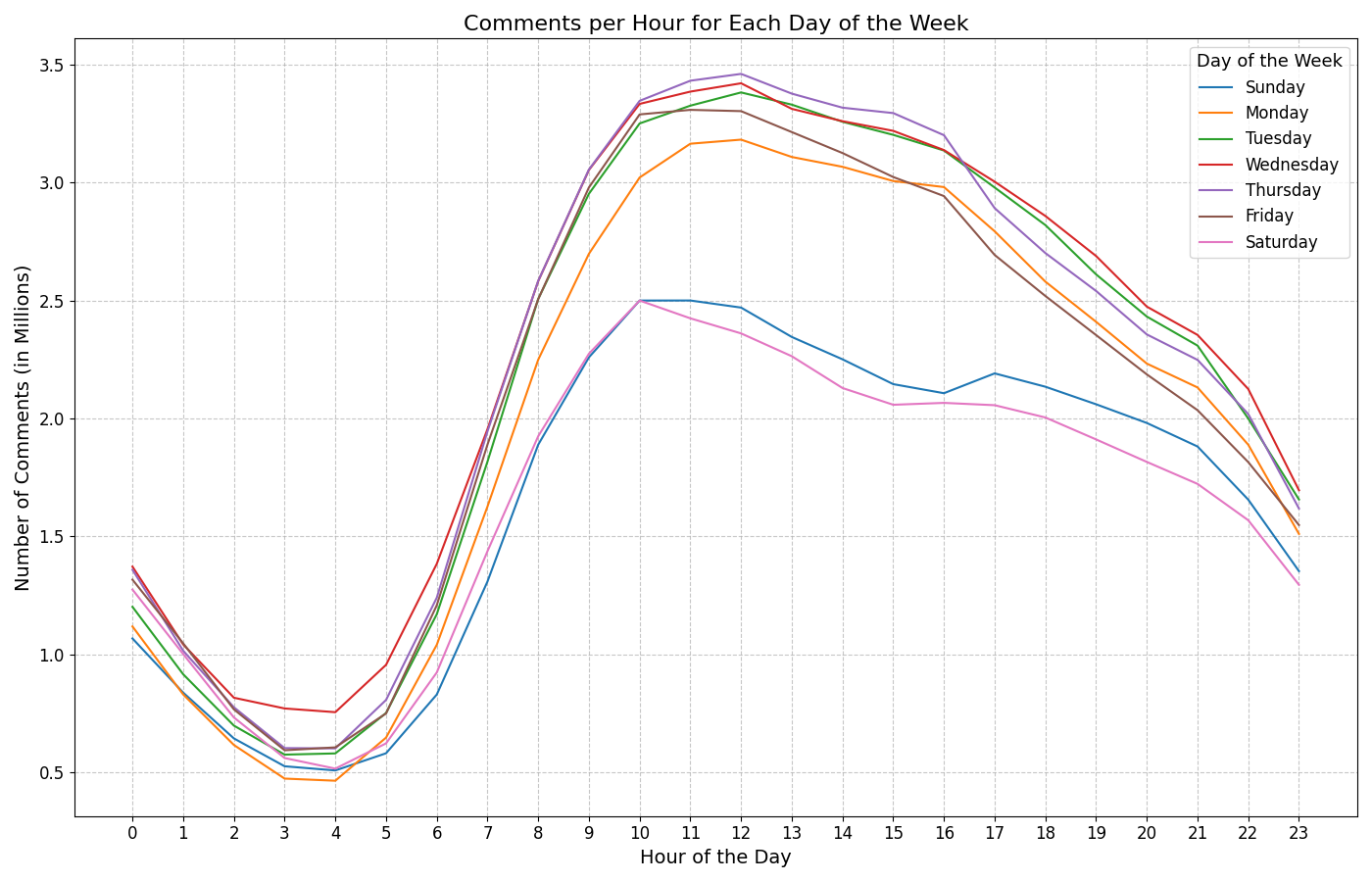
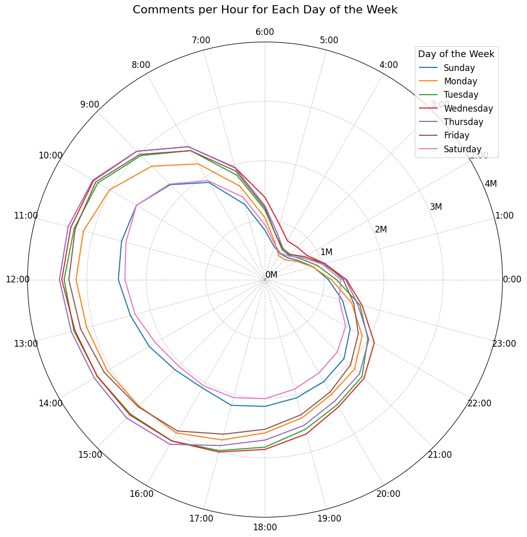
One of the first insights was the distribution of comments over time. I created a histogram to visualize the number of comments posted at different times of the day. This revealed interesting patterns, such as peaks in activity during certain hours, which I hadn't anticipated.

The deeper I dug, the more fascinating the data became. I analyzed the text of the comments to identify common themes and topics. By counting word frequencies and analyzing word pairs, I began to see the underlying connections between different topics.
Chapter 5: Visualizing the Story
Understanding the data was one thing—communicating it was another. I knew that to truly tell the story of the data, I needed to visualize it. I turned to Python’s powerful visualization libraries, such as Matplotlib and Seaborn, to create graphs that could bring the data to life.
import matplotlib.pyplot as plt

# Creating a histogram of comment times
plt.figure(figsize=(10, 5))
plt.hist(comment_times, bins=24, color='purple')
plt.title('Comment Activity Over 24 Hours')
plt.xlabel('Hour of the Day')
plt.ylabel('Number of Comments')
plt.grid(True)
plt.show()
Chapter 6: Exploring Deeper Connections
But I wanted to go further. Inspired by the connections I saw in the data, I decided to create a word graph—an interactive visualization that would show the relationships between words in the comments. This graph would highlight common word pairs, with the thickness of the lines indicating the strength of the connection.
import networkx as nx
import matplotlib.pyplot as plt

# Building the word graph
G = nx.Graph()

# Adding nodes and edges based on word co-occurrences
for word1, word2, count in word_pairs:
    G.add_edge(word1, word2, weight=count)

# Drawing the graph
plt.figure(figsize=(12, 12))
nx.draw(G, with_labels=True, node_size=[G.degree(n) * 100 for n in G.nodes()],
        font_size=10, node_color='skyblue', edge_color='gray', linewidths=1,
        font_weight='bold')
plt.title('Word Co-occurrence Graph')
plt.show()
This visualization was a game-changer. It not only provided insights into the common themes within the comments but also made the analysis process more engaging and interactive.
This visual is currently being process for display.
Chapter 7: Refining the Visuals
Creating visualizations is often an iterative process. As I developed more graphs, I refined them to better communicate the insights I was discovering. I experimented with different color schemes, layouts, and interactive features, aiming to make the graphs both informative and aesthetically pleasing.
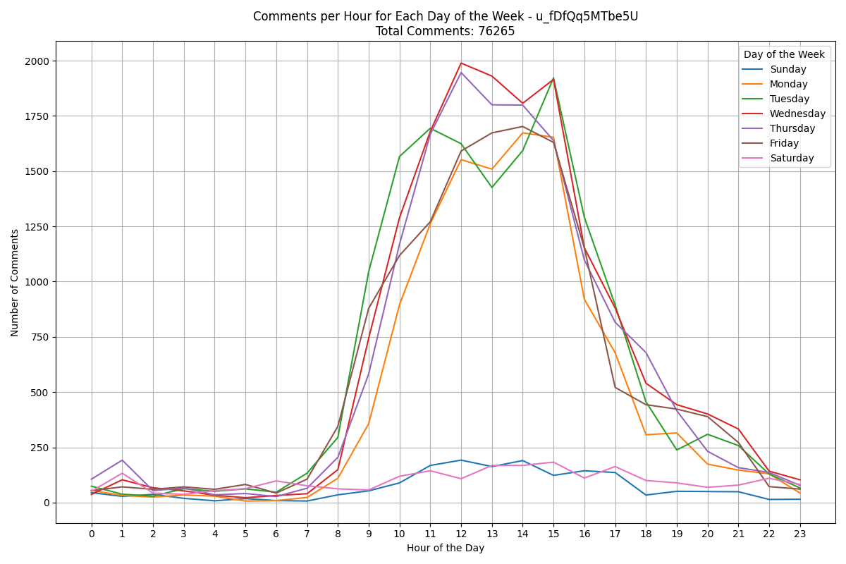
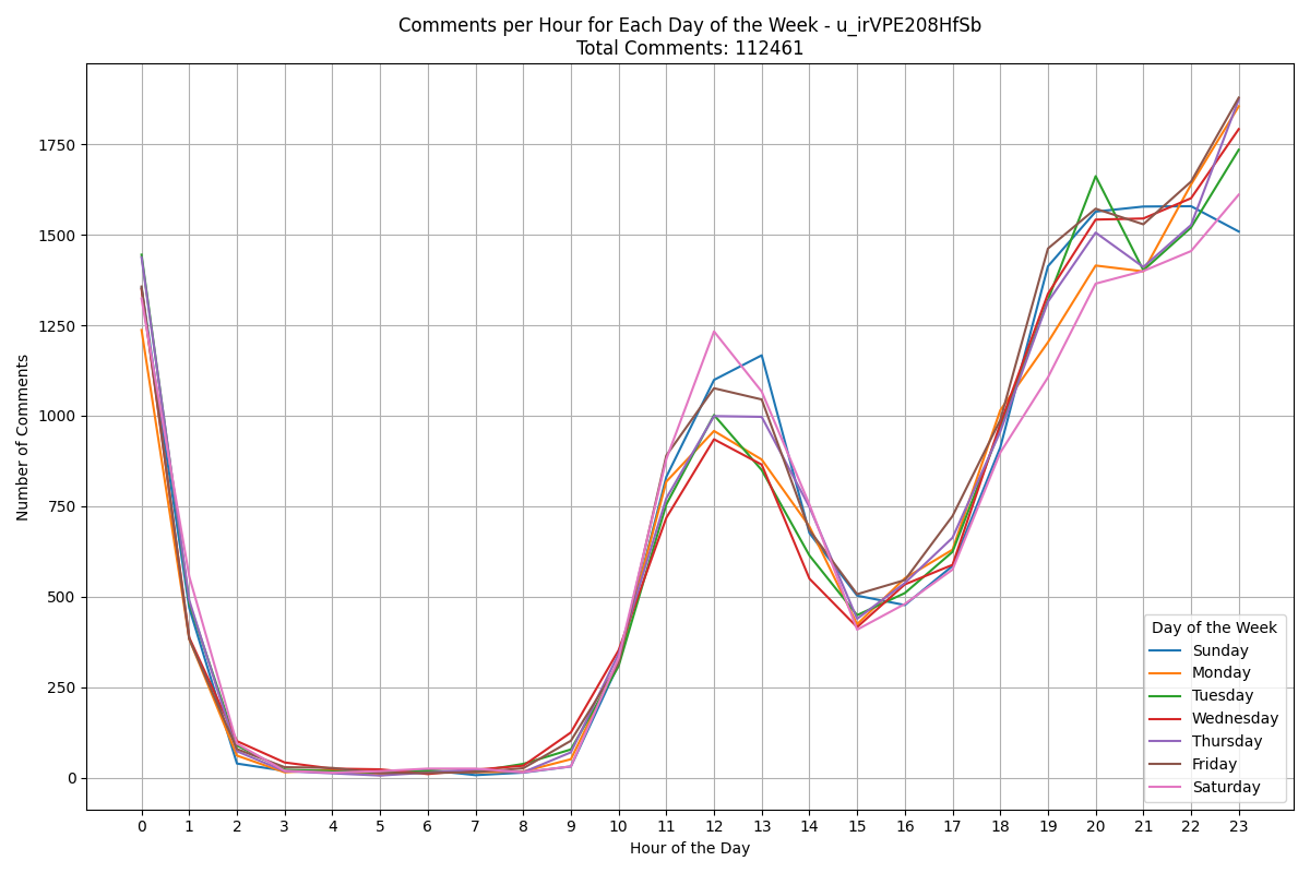
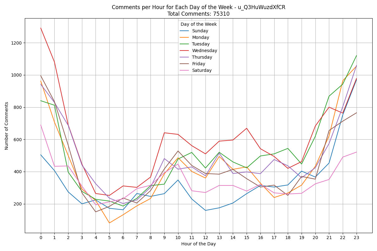
Here's some notable trends for commenting of certain users:
Chapter 8: The Journey Continues
This project has been a journey in every sense of the word—from the initial spark of curiosity to the final visualizations that brought the data to life. Along the way, I learned a great deal about data collection, storage, and analysis, as well as the art of storytelling through visualization.
But this is just the beginning. There are still more insights to uncover, more visualizations to create, and more stories to tell. I plan to continue exploring this data, refining my analyses, and sharing my findings with the world.
Stay tuned as I continue to dive deeper into the data and uncover more of the stories hidden within!
Conclusion
This project has been a labor of love, combining my passion for data with the thrill of discovery. By methodically collecting, storing, and analyzing public comment data, I've been able to extract valuable insights and present them in a way that is both engaging and informative. I hope this story inspires others to explore the potential of data and to see the beauty in the patterns that lie beneath the surface.